Overview
RV Business Website that hosts in-site bookings, has clean and friendly brand identity, and easy to navigate UX.
Roles and Parameters
ROLE: Independent UI/UX Designer
TIMEFRAME: 1 Month
CASE STUDY
Overview
RV Business Website that hosts in-site bookings, has clean and friendly brand identity, and easy to navigate UX.
Roles and Parameters
ROLE: Independent UI/UX Designer
TIMEFRAME: 1 Month
_____
Project Context
How might we design a RV business site to be a one-stop place to book spots easily?
As a NYU course project, I was challenged to create a web interface for a hypothetical company of my choosing.
Because my dad is currently in the midst of starting up his own RV company,
I decided to investigate competitor RV Park sites.
Most RV camping sites don’t have dedicated webpages, and go through third parties. For those that do, they often have outdated UI and cluttered UX elements.
Goal: Build a website for a RV Park Business that communicates
trustability with modern updates.
• Clear UX for easy navigation
• Convenient system for booking spots as first party site
• Clean UI
_____
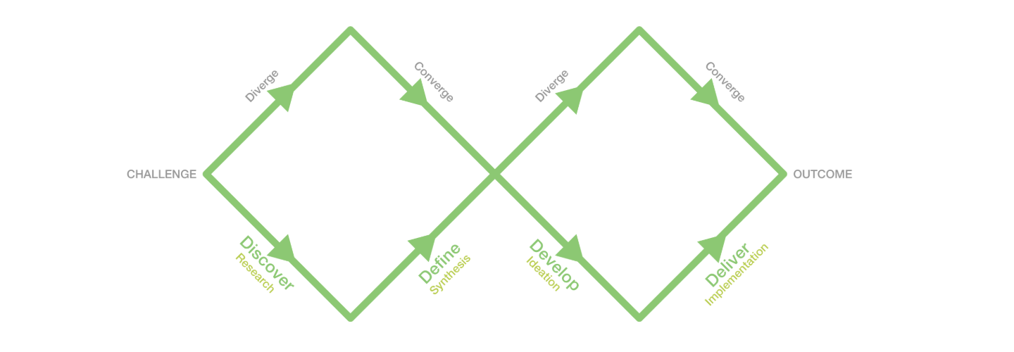
Discover
To begin this project, I sought to research the content a business site should hold, and the existing competitors on the market.
• What categories should the site hold? (Needs of market demographic)
• What form of Brand Design communicates the needs of market wants?
• What are existing competitor strengths and weaknesses?
Survey
First, to understand the target audience of the site, I created a google survey on the needs and wants of RVlifers, posted to related reddit threads.
This method was ineffective in gathering many responses due to the niche audience, but out of 3 thorough responses, I found these broad conclusions on market user needs:
Average Market Generation: >40 years old
Top 3 Priorities for RV parkers:
• Safety
• Price
• Amenities
The Most Frustrating aspects of reserving a RV parking spot:
• Inaccurate/Lack of Dimensions of spot
• Reserving to later find out there are no available spots
• Not knowing what the park’s availability is
Competitor Analysis
I then conducted a Competitor Analysis with 5 participants, talking through their user experience with competing sites local to the Seattle, Washington area.
Participants: 2 Gen Z, 2 Millennials, 1 Boomer
For the first site, 4 / 5 Participants noted:
• Sticky Header takes too much screen space
• UI is very traditional
• UI communicated trustworthiness
2/5 Participants noted Address and Email were extremely difficult to see.
2 other Participants had difficulty finding address.
5/5 Participants wished there was an option for in-site booking and updated availability beyond a contact.
For the second site, 3 / 5 Participants noted:
• Traditional UI again
• Clear pertinent information, but wish map was a clickable link
• Same Information was repeated around site
5/5 Participants noted the incomplete page was the biggest pain point on the site.
Competitor Analysis Key Takeaways
• Competitors have a Traditional UI that participants find outdated. Yet, aspects of that communicate dependability.
• Sites must be complete and updated for users to feel satisfied with their time on the site
• Keep pertinent information (address, rates, locations, etc) easy to find and access
• Repetition of the same information is tiresome and clutters what the user is trying to find
_____
Define & Design Iteration 1
From my research, I defined a central design goal:
How might we modernize the site UI to differentiate from competitors, but maintain an aspect of traditionalism to communicate trustability?
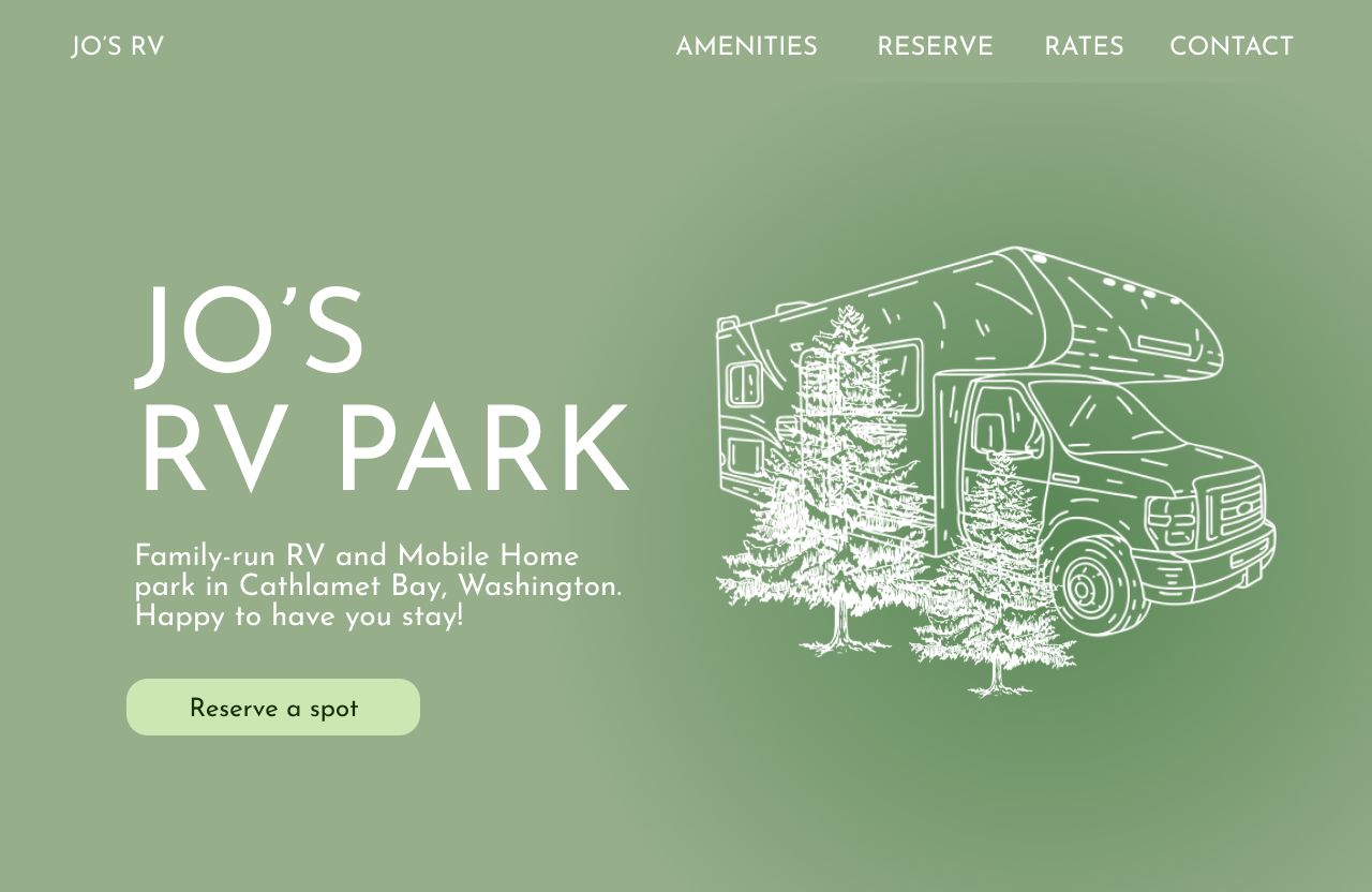
I first endeavored a more traditional, yet clear site lay out. This initial design phase prioritized the dependability and familiarity of websites that the target audience of older generations trust. Below is the home page mock up to visualize this direction 1:
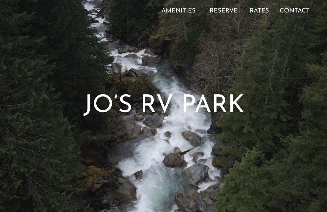
I then explored a more modern style, communicating a more modern and sharp feel. Similarly, I mocked up a home page for this direction 2:
After coming to the first 2 initial directions, I built out pages of both and gathered feedback from 5 new participants. Not yet at user-testing, but in the feelings users perceived each site to have.
Direction 1 was said to communicate hominess, friendliness, and family.
Direction 2 was said to communicate cleanliness, sharpness, and business.
Still, 3 / 5 Participants generally preferred the overall aesthetic of Design direction 2; with the other 2 participants unsure.
Key Feedback
From this research I received key feedback:
• Develop Direction 2 to host components of traditional UI
• Keeping only the home page as a full screen video
• Want more information on home page / scroll down
• Communicate the Family oriented trustability of the business
• Rates Chart would be nice
_____
Solution
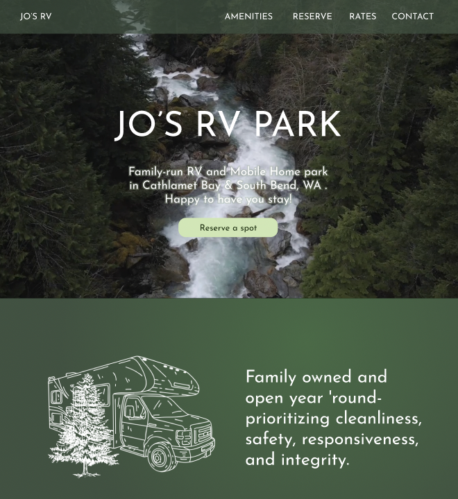
I then moved on to develop a direction that encompassed aspects of both stages prior.
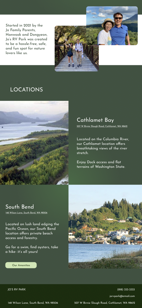
Added Home Page Elements:
• Video Background
• Clear CTA
• Mission Statement
• Family Business Story: Communicate dependability
• Locations
• Auto scroll Images
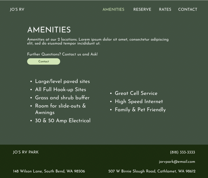
Added Amenities Page Elements:
• Description
• Contact navigation
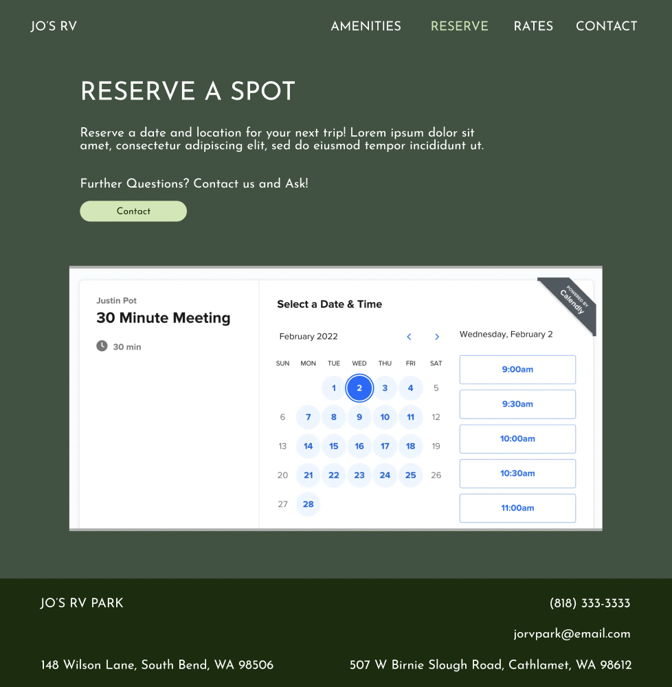
Added Reserve Page Elements:
• Description
• Contact navigation
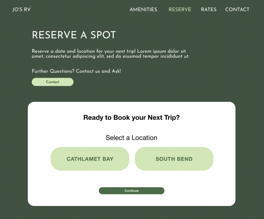
• In-site booking place holder
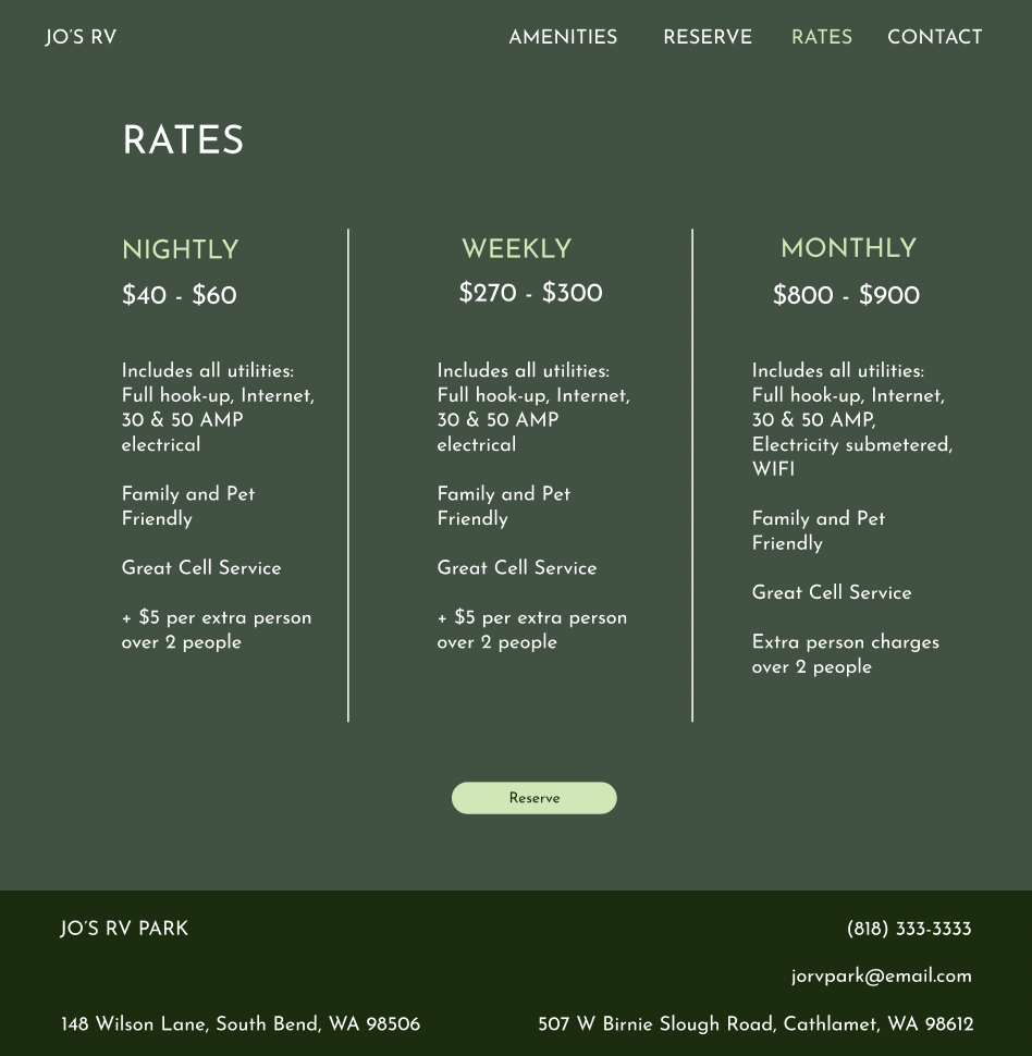
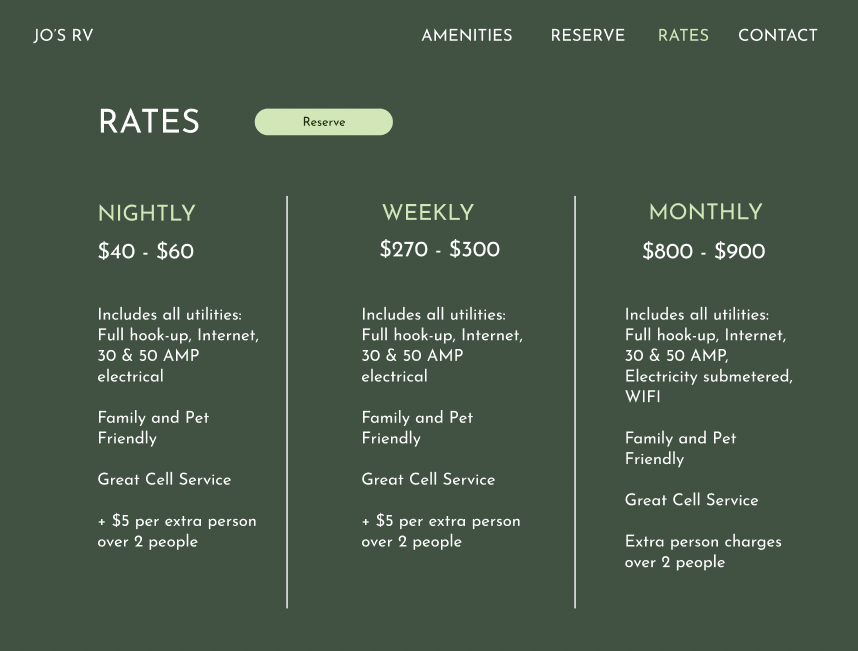
Added Rates Page Elements:
• Columns differentiating stay-types
• Reserve navigation
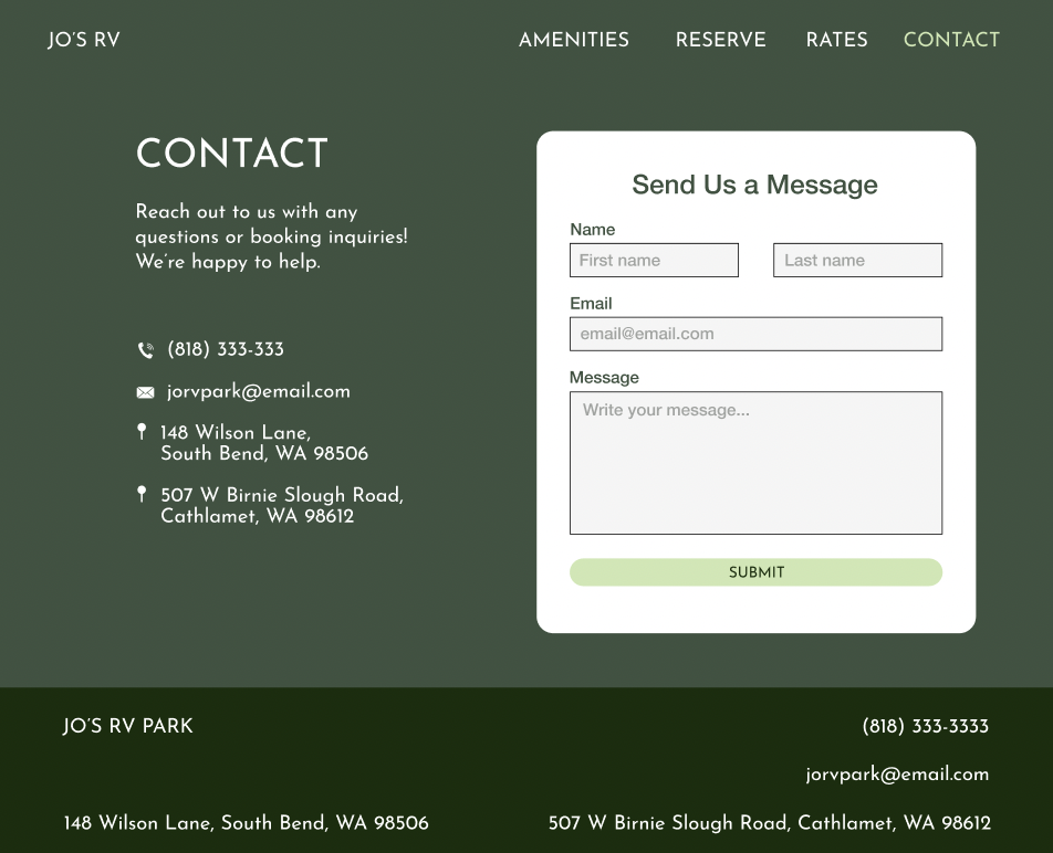
Added Contact Page Elements:
• All contact information in one page for easy navigation
• Description
• Icons
• Direct contact UI
_____
Usertesting
After presenting the second design phase to my NYU UX course, I usertested this prototype with 3 more participants.
Patrick L. (49): Books RV spots online 1-2 times/year for family of 3.
Samantha K. (32): Books camping and mobile home parking spots for independent travel year round.
Kevin M. (53): Books camping spots with room for rented vehicles once every 2-3 years for family of 5.
Final Feedback
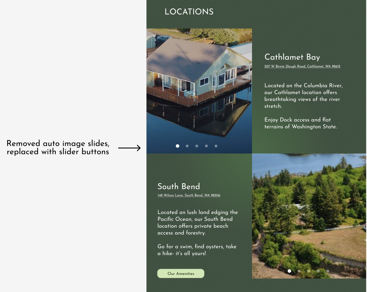
• Add buttons for accessibility to any image slides
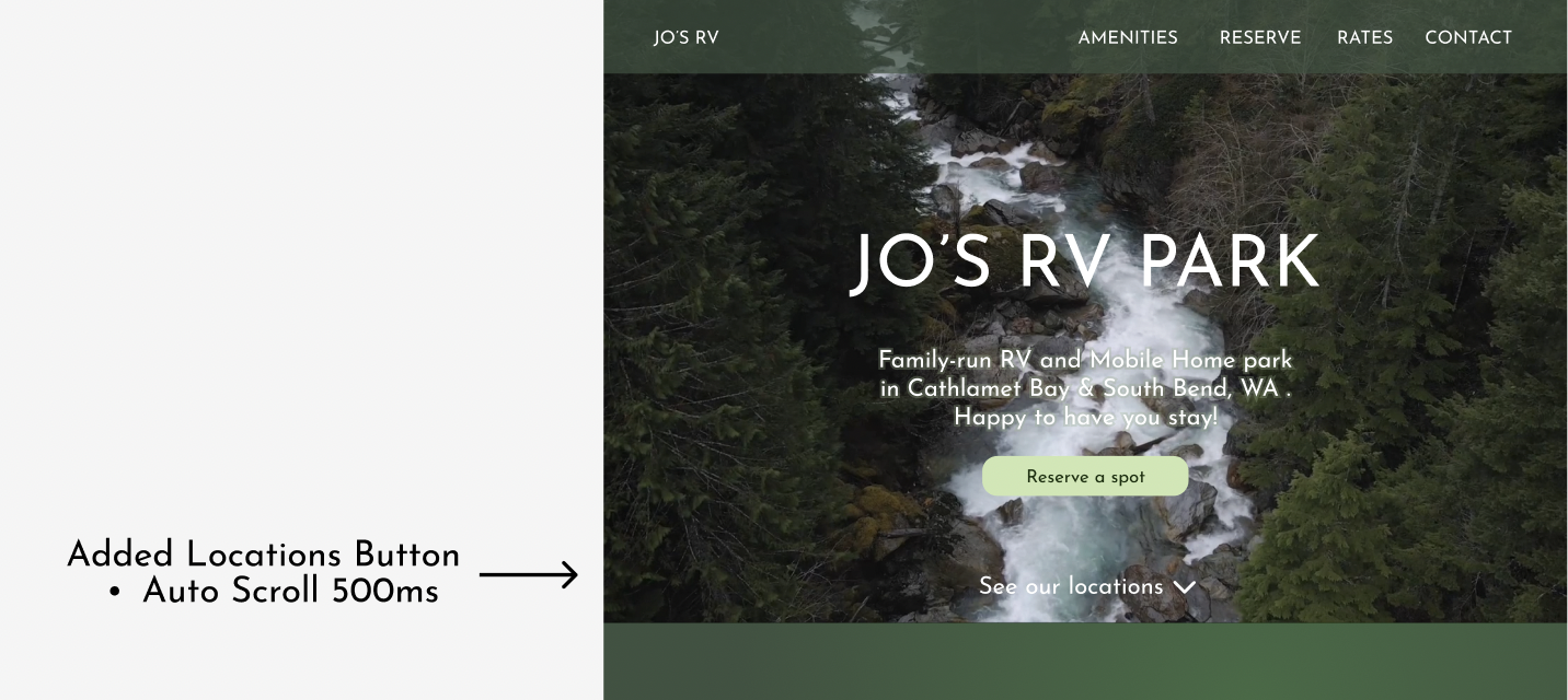
• Auto scroll to take people to locations on home page, if its not a separate tab
• Move Button to Reserve to be more clearly visible on rates page
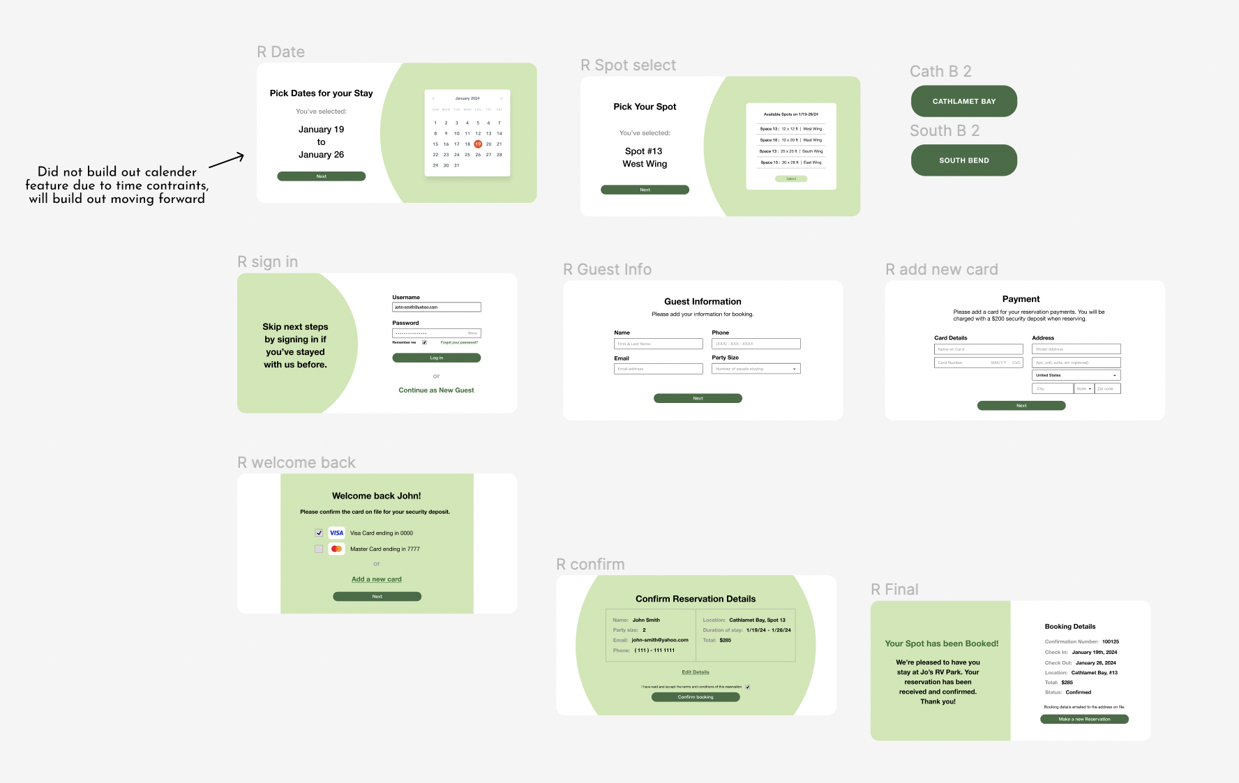
• Build UI for the booking, feels incomplete if it’s just a placeholder.
• Family cut-out section is great, and with the muted brand identity, the site
communicates friendliness while having an overall more modern aesthetic and
clear navigation vs existing competitors.
_____
Final Look
My final design iteration of the RV Part Site adopted feedback from above.
See Final Prototype on Figma
________________________
Added image slider with buttons on homepage for greater accessibility:
Added auto-scroll locations button for clarity of where this information is:
Moved reserve button to the top for greater visibility:
Built out in-site reservations component:
_____
Reflections
From ideation to delivery, I went through different iterations to achieve the following design goals:
• Cohesive Brand Identity
• Clean UX: Lay out information in natural, easy to find sections
• Modern Aesthetic, without losing trustability
Through constant testing and research, I feel I’ve come to complete these initial goals. However, I have much more to learn as I hope to continue on this prototype in the future.
Practicing the Process
There were many challenges throughout this project beyond the design- Finding appropriate user test participants was a huge bump in the road when I realized the target audience is more niche than just any website user. It was a big learning moment when I took a step back and realized I was designing for a group I was neither a part of personally nor familiar with through greater social circles. Through this project, I got to explore new outreach and research methods to gain the insight of those hypothetical users. Doing so was a timely task, and this definitely taught me where my weaknesses are and just how important organization is for the full development of a design. Practicing each stage of the UX design process is integral to my greater improvement as a product designer and is something I actively strive to further.
The Value of Critique
I was blessed to have the insights of my peers and professors throughout this project, and it became abundantly clear to me that designs are meant to be iterated over and over, and over, again. While far from perfect, my final prototype benefited from the critiques of my design community and showed me just how important the iterative process is.
Next Steps for Jo's RV Park Site
In my final NYU check-in presentation, I had mentioned the addition of subtle animations. However, I found that I did not have the time to add these elements.
Similarly, time constraints left the calender portion of the reserve page to be incomplete. These two elements are projected to be developed in the future, as this website will be used for my dad's small business.